Project Overview
Redesign of the Lead Capture & Advisory Flow at ComparaSoftware
Role: UX Lead – Research · Strategy · Experience Design
Company: ComparaSoftware · B2B SaaS Marketplace
Context
ComparaSoftware is a marketplace that connects businesses with the right digital tools—from CRMs and ERPs to project management software. The platform offers personalized software advisory services for free, funded by software vendors who receive qualified leads.
The B2B model is straightforward: the better the match between user and provider, the higher the conversion rate—and the revenue—for ComparaSoftware.
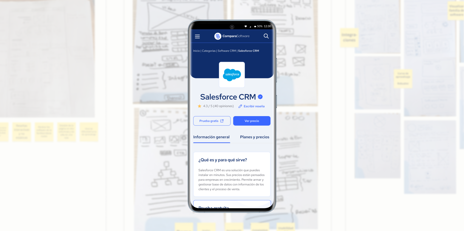
The Problem
The contact form had poor performance:
- Users completed the form but didn’t answer follow-up calls.
- The CTA “Get a Quote” was confusing—users didn’t understand what would happen next.
- The experience felt cold, transactional, and failed to reflect the value of the human advisory.
- Time was lost chasing leads that weren’t a fit (too small, low budget, unclear needs).
Research & Key Insights
As UX Lead, I proposed a round of internal interviews with the advisory team. We spoke with Cande (team lead) and multiple advisors who engage with users daily.
%206.28.36%E2%80%AFp.%C2%A0m..png)
Top insights included:
- Many users didn’t recognize who was calling or why—it felt like an unwanted interruption.
- The advisory call was crucial for lead qualification, but came with no context.
- The form didn’t surface the users’ real business needs.
- Technical terms like "ERP" or "CRM" didn’t resonate with how users described their problems.
- Some advisors made up to 10 call attempts per lead, wasting time.
- Category labels were vague, leading to mismatched expectations.
Redesign Goals
We aimed to reshape the lead capture and contact experience to:
- Humanize the interaction
- Align user expectations from the first click
- Increase engagement and response rates
- Pre-qualify leads before the first call
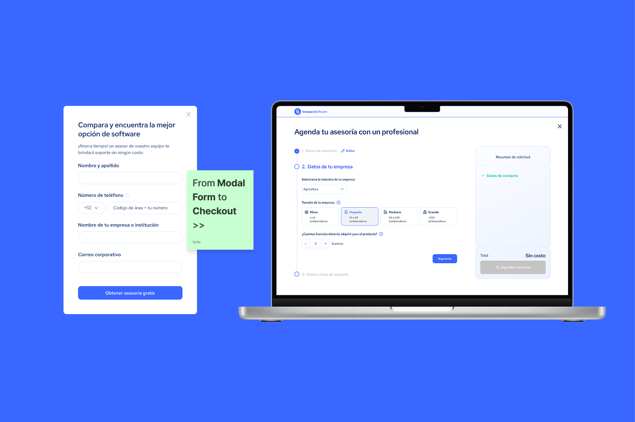
Proposed Solution
I led a full redesign of the capture flow, transforming it into a progressive B2B-style checkout, more like booking a free advisory service than filling out a generic form.
%206.30.39%E2%80%AFp.%C2%A0m..png)
✅ Key Changes:
1. Clearer CTA
From “Get a Quote” → to “Request Free Advisory”
→ Highlighting the value upfront
→ A/B tested verbs to boost CTR (+18%)
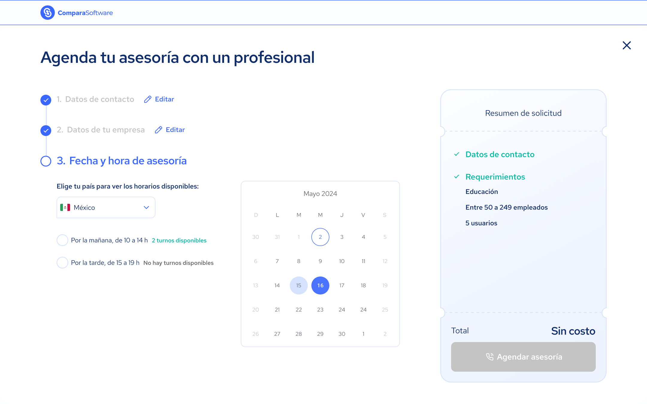
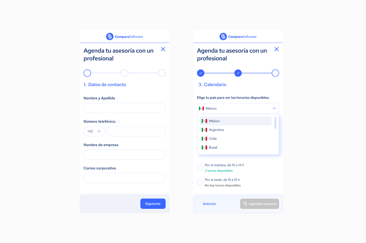
2. New 3-Step Flow (checkout-style)
- Step 1: Contact information
- Step 2: Basic requirements (industry, team size, key features)
- Step 3: Call scheduling with calendar integration
📈 This final step—scheduling a call—boosted effective contact rates by +27% in internal tests.
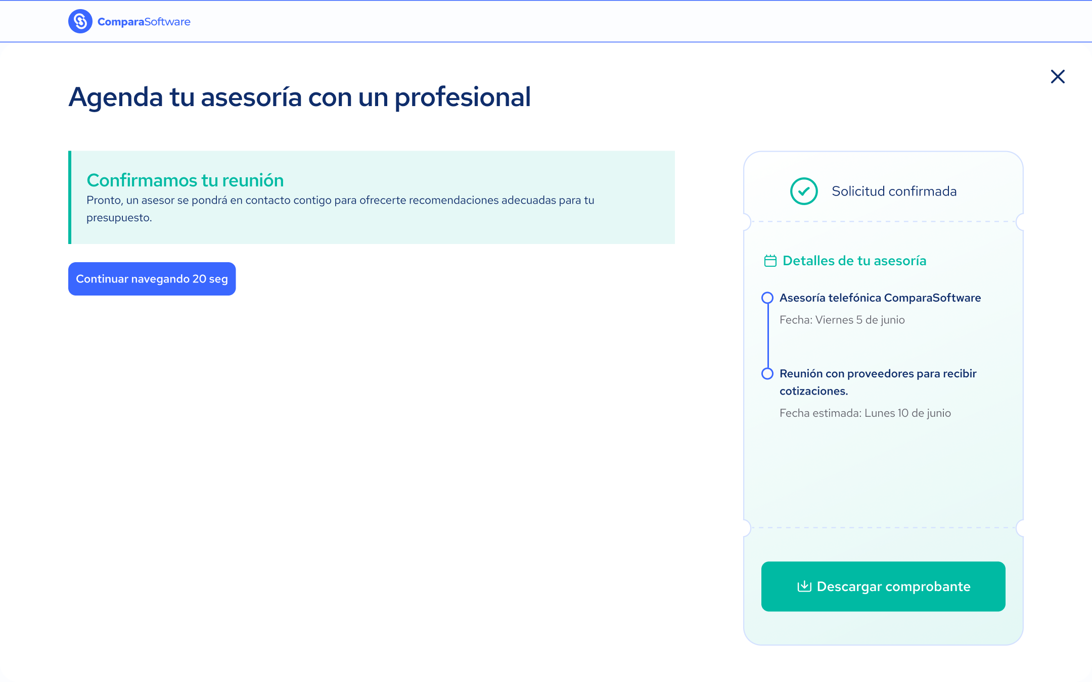
3. Success Message + Downloadable PDF
- Confirmation screen: “Your advisory request was successful. You’ll receive a call at your selected time.”
- Users could download a PDF confirmation—adding formality and credibility.
4. In-Form Educational FAQ
Topics covered:
- Why it’s free
- What to expect from the call
- How to prepare
- What happens next
→ This reduced friction and support questions at the start of the call.
%2010.13.48%E2%80%AFa.%C2%A0m..png)
5. Automatic Segmentation & Pre-Qualification
- New fields detected unqualified users earlier (solo founders, no budget, vague goals).
- Internal scoring system based on email domain, company size, and requirement clarity.
Challenges & Learnings
- Initial resistance: Some stakeholders saw forms as passive data collectors—not part of the user journey.
- Scheduling tool integration required multiple adjustments and syncing with advisor tools.
- The "free checkout" metaphor worked—but some users still expected a product demo. We refined copy to clarify the service value.
💬 Final Reflection
This project proved that UX begins before users interact with the product.
Designing a high-performing form is not about UI fields or colors—it’s about expectation management, education, qualification, and trust-building.
As UX Lead, I guided a solution with direct business impact, collaborating with marketing, sales, support, and dev teams.