ComparaSoftware | Role: UX Lead – Product Designer
Introduction
From internal assumptions to real opportunities. I led a deep UX research to understand how people search B2B software and redesign the full experience.
We validated and redesigned
We connect people with digital tools. But we asked ourselves:
Do we really understand how users search for software on our platform?
I led an in-depth UX research process to explore that question, validate our assumptions, and identify real opportunities for improvement.
The approach
We started with internal hypotheses about how users choose B2B software.
We defined clear research goals and designed open-ended questions to map the full search experience.
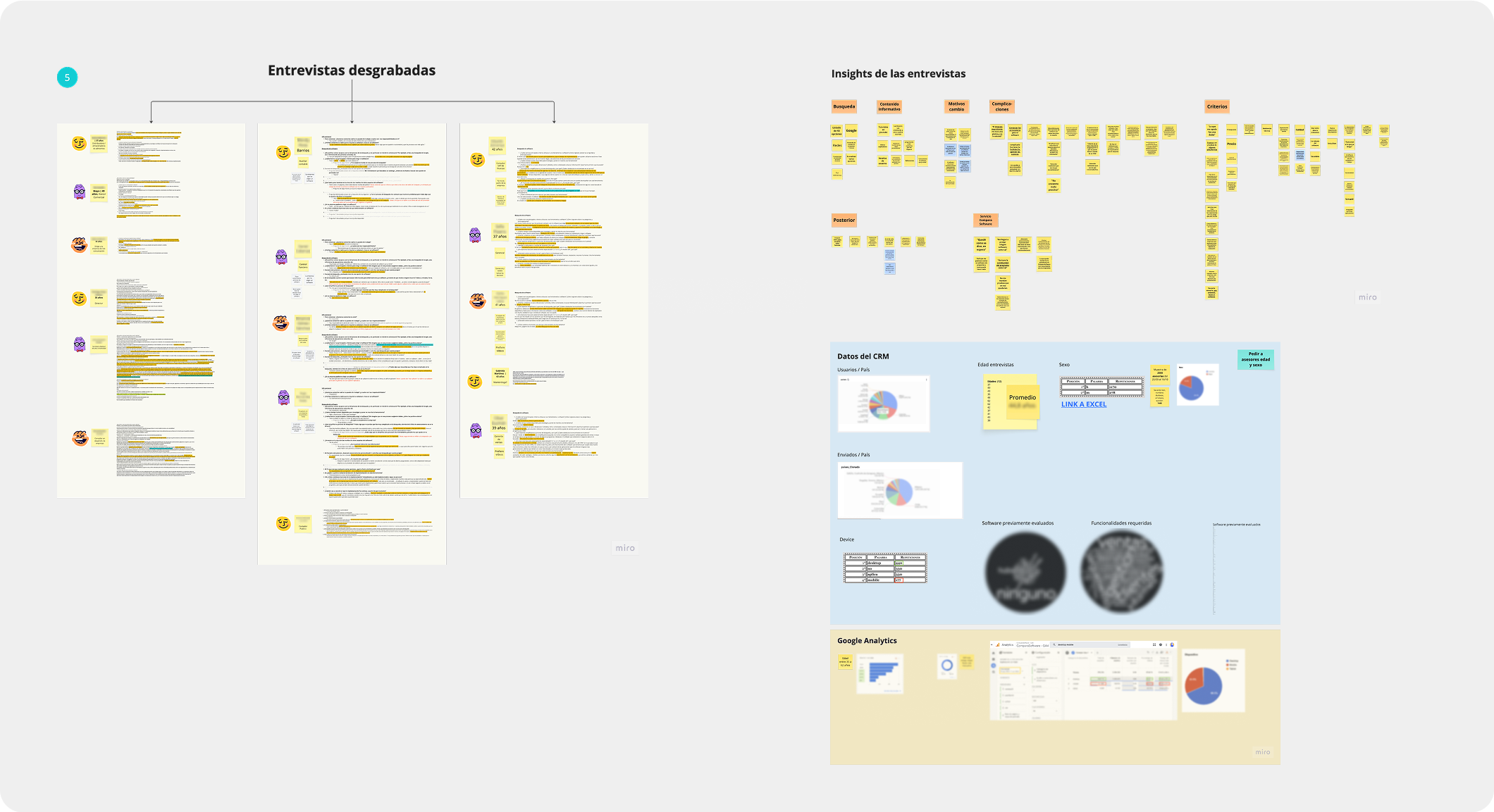
I created a semi-structured interview guide, which we refined as a team to sound more natural and friendly. Our goal was to build trust and collect honest, detailed stories.

Research in action
We ran remote interviews with people who had already searched for software. Before launching the sessions, we fine-tuned the script: tone, order, and introduction.
🔍 A key insight: being transparent about who we were and what we were doing helped increase participants' willingness to share.
We structured the interviews in two parts:
- Search process
- Use of tools and tech
What we discovered
We identified clear patterns:
- Many people didn’t know the name of what they needed.
- Searching felt harder than choosing.
- Filters created friction and trust was lost due to confusion.
To validate and enrich the findings, we triangulated data from Zoho CRM and Google Analytics: session time, clicks, bounce rate, lead source, company type, and software searched.
From findings to ideas
We filtered key insights and turned them into action triggers.
Using POV (Point of View) to define context, need and insight, and HMW (How Might We) to turn problems into design opportunities.
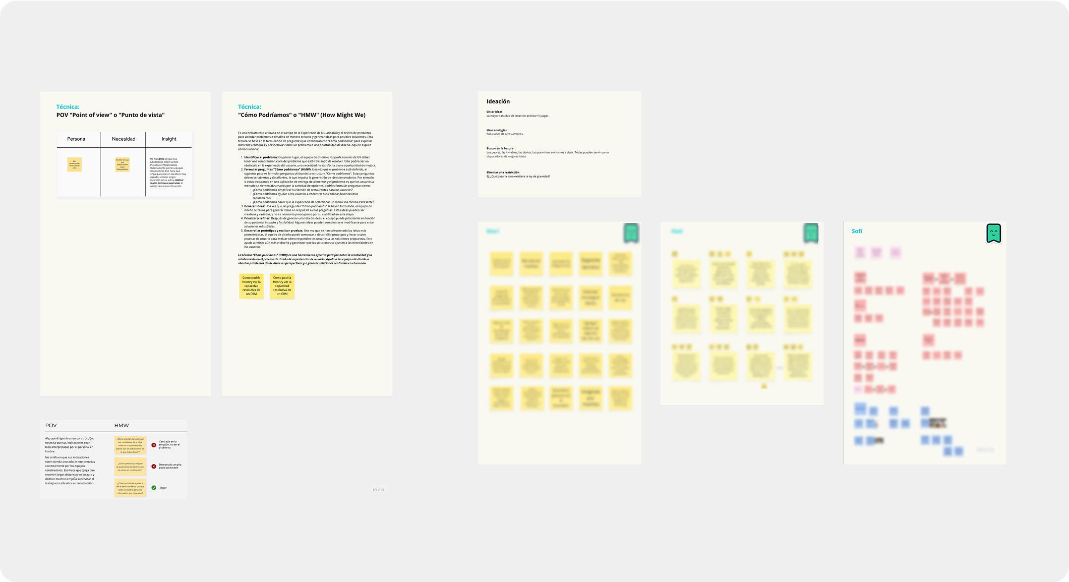
I facilitated an ideation session using Crazy 8s and a prioritization matrix. We grouped, scored, and analyzed ideas based on:
- User benefit
- Business impact
- SEO value
- Implementation time
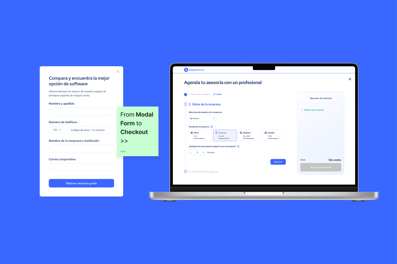
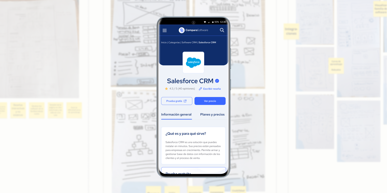
From there, we shaped solutions for a guided search template and clearer, personalized software profiles.

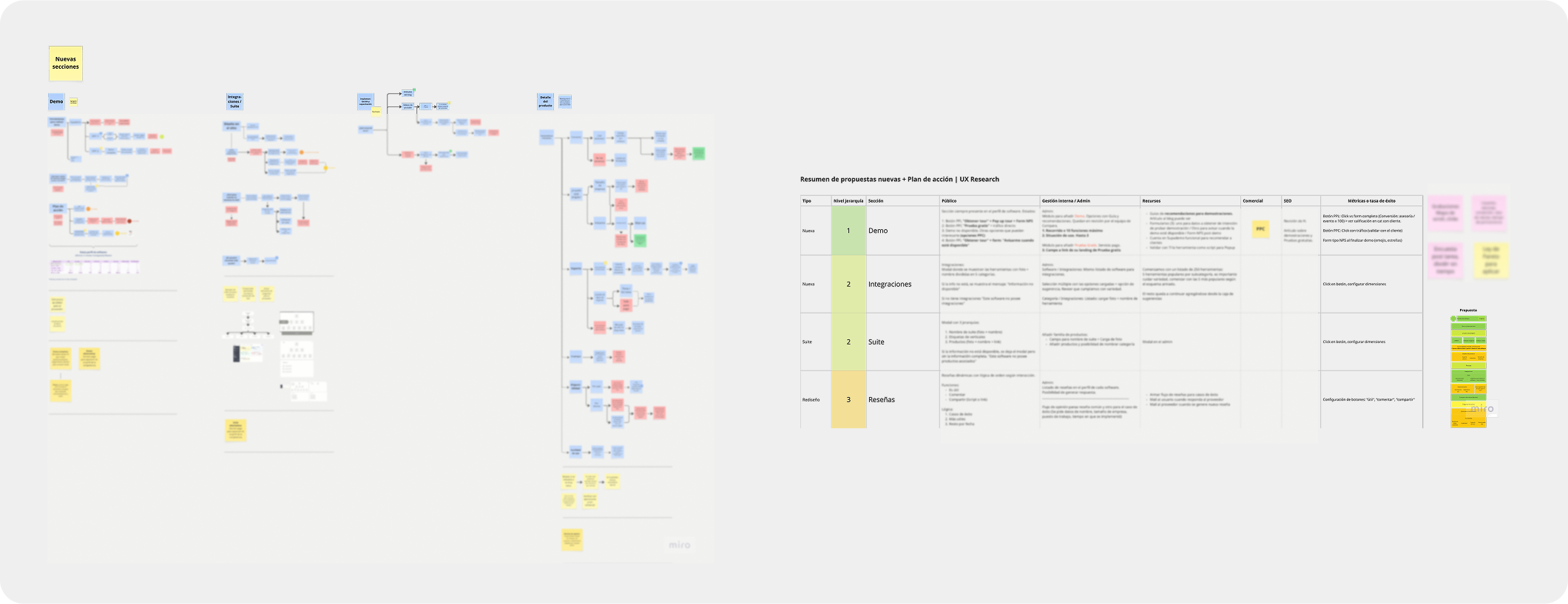
From insight to design: Architecture & UI
With validated insights, we redesigned the experience.
First, we reorganized the information architecture—for both end users and internal teams.
We redefined the search flow, prioritized content, grouped key features, and designed paths for both the public site and the internal back office.
📈 Proposed success metrics:
- Form conversions
- Time on page and navigation flow
- Qualitative feedback
- Internal team usage of the dashboard
The new template
We created a guided, cleaner, and easier-to-maintain interface.
The result improved both the user experience and the internal team’s workflow.
%206.23.49%E2%80%AFp.%C2%A0m..png)
Validation and learnings
We launched the new version in a controlled release and collected feedback with on-site surveys.
Users appreciated the clarity of the new flow and the step-by-step guidance.
We considered adding live software demos to each profile, but after speaking with vendors, legal barriers led us to exclude that feature from the MVP.
This project changed how we understand software search. It opened new paths to iterate on our business model, content strategy, and overall experience.
Design with real impact
This was a cross-functional project where structured UX research became the engine for decisions that truly mattered.
As UX Lead, the most valuable part was seeing how active listening, strategic analysis, and team collaboration can transform not only the product—but the business direction as well.
Tools used
- Miro – Research, ideation, synthesis
- Zoho CRM – Sales behavior analytics
- Google Analytics – Traffic and conversion metrics
- Figma – Wireframes, prototypes, UI
- Google Meet / Toki – Remote interviews and testing
- Sheets / Docs – Information tracking and consolidation